Risk-Return Analyzer - Tool


Hypothetical results for educational purposes only. Not predictions or advice.
Key Takeaways
- The efficient frontier keeps the highest expected return for each risk level based on inputs; it’s a model, not a promise.
- The Sharpe ratio summarizes excess return per unit of volatility; higher isn’t always “better” if the inputs are unrealistic.
- Correlations matter - low or negative correlations can reduce overall volatility; correlation regimes can change.
How the Tool Works (in plain English)
The analyzer takes three inputs for each asset class:
- Expected return (μ)
- Volatility (σ, standard deviation)
- Correlation matrix (how assets move together)
From these, it builds a covariance matrix and explores many long-only weight combinations. The efficient frontier is the set keeping the highest expected return at each risk level - the curve you see on the chart. This idea traces back to Harry Markowitz’s “Portfolio Selection,” which formalized the frontier concept and mean-variance optimization.
So what? Seeing where a current mix sits relative to the frontier can help an investor judge whether inputs imply room for improvement - or whether expectations need a reality check.
Sharpe Ratio: A One-Line Score - With Caveats
The analyzer reports the Sharpe ratio:
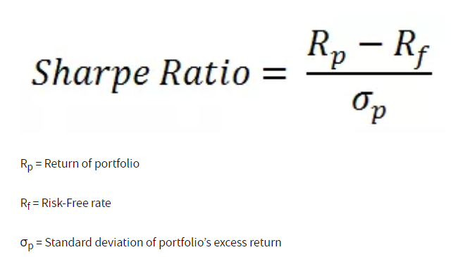
It’s a concise way to compare portfolios on excess return per unit of risk. Useful, yes - but it’s only as good as the inputs and assumes normally distributed returns, which markets often violate.
- Tip: Stress-test Sharpe by tweaking inputs (lower expected returns, higher volatility) to see how quickly the score changes.
Why Correlations Are the Quiet Lever
Diversification isn’t just “own more things.” It’s own things that don’t always move together. Investor.gov explains that combining assets with different risk drivers can lower overall volatility. But correlations are fluid - in 2022, stocks and bonds fell together, compressing diversification benefits. When using the analyzer:
- If correlations rise (toward +1), the frontier flattens - less reward for extra risk.
- If correlations fall (toward 0 or negative), the frontier bows outward - more potential diversification benefit.
So what? Check how sensitive your frontier is to a few correlation scenarios; this guards against false comfort from a single regime.
Risk Contribution: What’s Actually Driving the Ride
Two portfolios with the same volatility can have very different risk drivers. Risk contribution (sometimes called contribution to risk) decomposes portfolio volatility and shows each asset’s share of the total -often using marginal contribution formulas that relate weights to the covariance matrix. This method is widely used in professional risk reporting and asset-allocation research. Typical patterns the analyzer reveals:
- Equities can contribute >60% of volatility even at ~40–50% weight.
- Bonds/REITs may carry more risk than their weights suggest if correlations rise.
- Cash/short-term assets usually contribute little risk, anchoring the mix.
Using the Analyzer Productively
- Start with conservative inputs. Use long-run capital-market assumptions from reputable sources, then explore ranges.
- Scenario test correlations. Add “stress” cases where stock-bond correlation rises; compare frontiers. (Vanguard documents these regime shifts.)
- Watch risk contribution. Aim for a mix where the risk budget aligns with comfort and time horizon.
- Mind real-world frictions. Taxes, fees, and trading costs can alter the live experience; Investor.gov notes diversification doesn’t assure profit or prevent loss.
Want a second opinion on your portfolio’s structure? Tools like PortfolioPilot can analyze diversification alongside tax, fee, and risk factors - free to try.
This interactive tool uses simplified statistical assumptions to model portfolio risk and return relationships for illustrative and educational purposes only. Results are hypothetical and do not represent actual or guaranteed investment outcomes. Calculations exclude taxes, trading costs, and market shifts. This tool does not provide investment, tax, or financial advice.
How optimized is your portfolio?
PortfolioPilot is used by over 30,000 individuals in the US & Canada to analyze their portfolios of over $30 billion1. Discover your portfolio score now:

Analyze your entire net worth
360° portfolio analysis, AI Assistant, and personalized recommendations guided by our Economic Insights Engine.